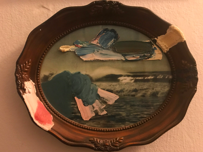
Some “no shit shiela” in Queensland told her pot-bellied ex-surfer husband to finally get rid of that old crap photo. The one of Byron Bay with the crappy wood frame. The chippy bogan melted with chagrin as he placed it in a box in the front yard. My friend, Ben Pontè stopped by the boot sale one afternoon and saw where he could improve upon nature and Man. He pulled a pound coin out of his pocket; threw it on the card table, and walked the Tondo home under his arm, his beneficent confidence radiating out of his ruddy grin. If you’ve ever met Ben, then you know exactly what I mean.
Ben gave me his painting (found art assemblàge?)8 years ago in Sydney when I was there teaching with him at Jois Yoga. I had drooled over it pretty hard and his selfless gift left a mark on my heart. There are a lot of interesting things going on here. It’s titled “The Wave” - of course.
So.. somewhere along the way Ben found a Tondo photograph of the surf in Australia. I can’t imagine the look of pride on the man who framed this standard silvertint photograph with this extraordinary “twee” frame. There is a lot to unpack here already and we haven’t even got into the paint.
Rudoph Steiner in his seminal work on artistic composition “Power of the Center” speaks about the special effect a circle has on us as a directional frame. It is different from a square or a rectangle. That kind of space is easier to penetrate. With four lines the fifth line to enter the space is an easier walk inside.
It’s easier to enter a pictorial space framed within a rectangle I mean. With a circle we tend to move around it rather than enter into its precious content. It’s harder to make deep illusionistic space with a circle.
Ben artfully navigates this with his color choices and his brush-marks. These additions to the found object - the tondo - make the space deeper and more interesting. That is, he adds a scrim or a surface like a lid on a petri dish that we then have to go around to get inside and thus creates a deeper space by drawing attention to the extreme foreground.
With landscape images, it’s always about the foreground. The wave itself is nice. Everybody wants to photograph or paint that wave. (or coliseum or sunset or mountain)
How to get to it is the Problem of Landscape and Ben solves it here with these thick impasto layers… Layers themselves that call up the sensation of waves. The most interesting part of this painting (or maybe it becomes ‘sculpture’ at this point?) is that Ben uses paint in a wave like action to look like waves themselves. Delicious.
It is incredibly difficult to get something in the foreground of your landscape that is as interesting as the object in the distance that called you to paint in the first place. That he paints on the frame itself is super helpful. As I said before the frame is pretty “twee.”
I’ve spent some time in Britain and I feel fairly equipped to define the term. There is now an attitude about “twee culture.” It’s like a hipster mustache or a bowtie in America. It’s kind of cool and old fashioned like steampunk or kitsch or camp. The problem there for a Brit is that twee is never cool. It’s always conflated with Conservative fashion.
If you put lace underneath your Romanesque pottery for example, or have paper orchids in your downstairs bath... That’s twee. It’s not “kitsch” because its not intentional. Its an overt and slightly ostentatious effort to “appear classy.” The effort to be classy is never classy. It’s disgusting. It’s bringing a dozen roses and chocolate to a first date... That’s twee.
So shitting all over this frame with the impasto helps this object a lot. It makes it valuable to me. Whereas the original object without the paint would sell for a pound in a boot sale. This thing starts to become part of the cultural fabric. It becomes intrinsically Australian rather than obviously Australian. Ben becomes himself by painting on this object. We note Ben and his character, his wit, his nostalgia, and his verve all in one go.
Just to finish, there is also an inherent colour dynamic that Ben plays with. A warm cool contrast from the print to the frame. Cool silver tones from the wave and warmth and cocoa tones from the frame. It naturally sits together due to their low saturation. The brown and silver are both soft “gray” chromatics of orange and blue respectfully.
Ben here saturates the tone. There on the bottom left is a dab of dynamic magenta offsetting the pastel canary yellow sitting on the pink. Ultramarine blue literally splashes out of the silver chroma of the burnt umber admixture on top of the print. By playing with the saturated tones and gently pushing the envelope he lights up the whole picture, and by adding these hot dabs he is literally adding life to a dead object.
Driving the composition from the immediate hot pink bottom left back to the ultramarine and orthogonally up and right to the canary Ben adds that through line, that fifth line that makes the Tondo more dynamic spatially as well. It’s like adding a counter clockwise motion to a clock. One that pushes forward and back as well as left to right. A clock that moves from the front of the tube with the hot pink to the back of the funnel of the silver back wall of the photograph. How appropriate.
This is why I like paintings. When I look at them the movement and the action of the color and lines and space move my eye forward and back and left and right. It becomes a figure eight and I become entranced.. fascinated. It becomes something that I want to look at every day for 30 or 40 more years. That's good painting. I think Great painting is when it does that to most everybody and also moves the intellectual faculties forward and back as well.
I am a big fan of this work: http://www.benponte.com